ProgressBar
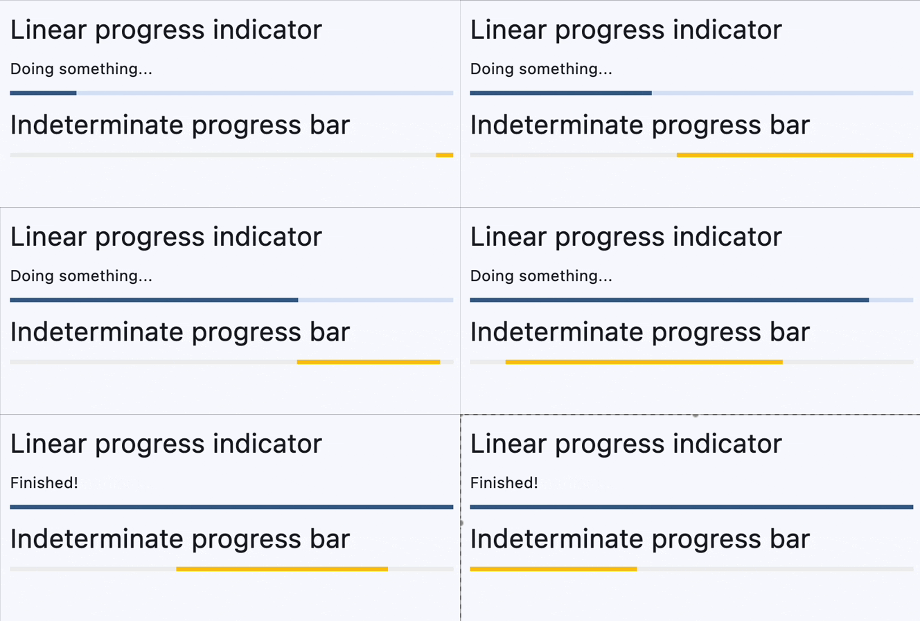
A material design linear progress indicator, also known as a progress bar.
A control that shows progress along a line.
Inherits: LayoutControl
Properties
-
bar_height(Number | None) –The minimum height of the line used to draw the linear indicator.
-
bgcolor(ColorValue | None) –Color of the track being filled by the linear indicator.
-
border_radius(BorderRadiusValue | None) –The border radius of both the indicator and the track.
-
color(ColorValue | None) –The progress indicator's color.
-
semantics_label(str | None) –The semantics label for this progress indicator.
-
semantics_value(Number | None) –The semantics label for this progress indicator.
-
stop_indicator_color(ColorValue | None) –The color of the stop indicator.
-
stop_indicator_radius(Number | None) –The radius of the stop indicator.
-
track_gap(Number | None) –The gap between the indicator and the track.
-
value(Number | None) –The value of this progress indicator.
-
year_2023(bool | None) –If this is set to
False, the ProgressBar will use the latest Material Design 3
Examples#
Determinate and indeterminate progress bars#
import asyncio

import flet as ft


async def main(page: ft.Page):
    determinate_bar = ft.ProgressBar(width=400)
    determinate_message = ft.Text("Doing something...")

    page.add(
        ft.Text(
            value="Linear progress indicator",
            theme_style=ft.TextThemeStyle.HEADLINE_SMALL,
        ),
        ft.Column(controls=[determinate_message, determinate_bar]),
        ft.Text(
            value="Indeterminate progress bar",
            theme_style=ft.TextThemeStyle.HEADLINE_SMALL,
        ),
        ft.ProgressBar(width=400, color=ft.Colors.AMBER),
    )

    for i in range(0, 101):
        determinate_bar.value = i * 0.01
        await asyncio.sleep(0.1)
        if i == 100:
            determinate_message.value = "Finished!"
        page.update()


ft.run(main)
Properties#
class-attribute
instance-attribute
#
bar_height: Number | None = None
The minimum height of the line used to draw the linear indicator.
Raises:
-
ValueError–If
bar_heightis negative.
class-attribute
instance-attribute
#
bgcolor: ColorValue | None = None
Color of the track being filled by the linear indicator.
class-attribute
instance-attribute
#
border_radius: BorderRadiusValue | None = None
The border radius of both the indicator and the track.
Defaults to BorderRadius.all(0) - rectangular shape.
class-attribute
instance-attribute
#
color: ColorValue | None = None
The progress indicator's color.
class-attribute
instance-attribute
#
semantics_label: str | None = None
The semantics label for this progress indicator.
class-attribute
instance-attribute
#
semantics_value: Number | None = None
The semantics label for this progress indicator.
Raises:
-
ValueError–If
semantics_valueis negative.
class-attribute
instance-attribute
#
stop_indicator_color: ColorValue | None = None
The color of the stop indicator.
If ProgressBar.year_2023 is True or Theme.use_material3
is False, then no stop indicator will be drawn.
If not set, then the ProgressIndicatorTheme.stop_indicator_color will
be used. If that is not set, then the ColorScheme.primary will be used.
class-attribute
instance-attribute
#
stop_indicator_radius: Number | None = None
The radius of the stop indicator.
If ProgressBar.year_2023 is True or Theme.use_material3 is
False, then no stop indicator will be drawn.
Set stop_indicator_radius to 0 to hide the stop indicator.
If not set, then the ProgressIndicatorTheme.stop_indicator_radius
will be used. If that is not set, then defaults to 2.
class-attribute
instance-attribute
#
track_gap: Number | None = None
The gap between the indicator and the track.
If ProgressBar.year_2023 is True or
Theme.use_material3 is False, then no track gap
will be drawn.
If not set, then the ProgressIndicatorTheme.track_gap will be
used. If that is not set, then defaults to 4.
Tip
Set track_gap to 0 to hide the track gap.
class-attribute
instance-attribute
#
value: Number | None = None
The value of this progress indicator.
A value of 0.0 means no progress and 1.0 means that progress is complete. The
value will be clamped to be in the range 0.0 - 1.0.
Defaults to None, meaning that this progress indicator is indeterminate -
displays a predetermined animation that does not indicate how much actual progress
is being made.
Raises:
-
ValueError–If
valueis negative.
class-attribute
instance-attribute
#
year_2023: bool | None = None
If this is set to False, the ProgressBar will use the latest Material Design 3
appearance, which was introduced in December 2023.
When True, the ProgressBar will use the 2023 Material Design 3 appearance.
If not set, then the ProgressIndicatorTheme.year_2023 will be
used, which is False by default.
If Theme.use_material3 is False, then this property is ignored.
