ExpansionTile
A single-line ListTile with an expansion arrow icon that expands or collapses the tile to reveal or hide its controls.

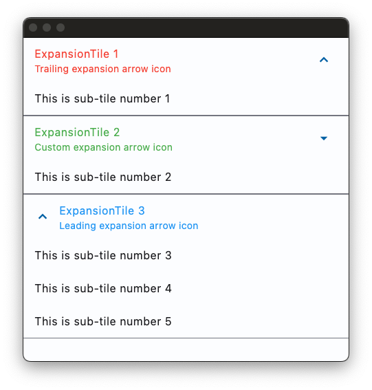
Basic ExpansionTile
Inherits: LayoutControl, AdaptiveControl
Properties
-
bgcolor(ColorValue | None) –The color to display behind the sublist when expanded.
-
clip_behavior(ClipBehavior | None) –The content will be clipped (or not) according to this option.
-
collapsed_bgcolor(ColorValue | None) –Defines the background color of tile when the sublist is collapsed.
-
collapsed_icon_color(ColorValue | None) –The icon color of tile's expansion arrow icon when the sublist is collapsed.
-
collapsed_shape(OutlinedBorder | None) –The tile's border shape when the sublist is collapsed.
-
collapsed_text_color(ColorValue | None) –The color of the tile's titles when the sublist is collapsed.
-
controls(list[Control] | None) –The controls to be displayed when the tile expands.
-
controls_padding(PaddingValue | None) –Defines the padding around the
controls. -
dense(bool | None) –Whether this list tile is part of a vertically dense list. Dense list tiles default
-
enable_feedback(bool) –Whether detected gestures should provide acoustic and/or haptic feedback. For
-
expanded_alignment(Alignment | None) –Defines the alignment of children, which are arranged in a column when the tile is
-
expanded_cross_axis_alignment(CrossAxisAlignment) –Defines the alignment of each child control within
controlswhen the tile is -
icon_color(ColorValue | None) –The icon color of tile's expansion arrow icon when the sublist is expanded.
-
leading(IconDataOrControl | None) –A
Controlto display before the title. -
maintain_state(bool) –A boolean value which defines whether the state of the
controlsis maintained -
min_tile_height(Number | None) –The minimum height of the tile.
-
shape(OutlinedBorder | None) –The tile's border shape when the sublist is expanded.
-
show_trailing_icon(bool) –Whether to show the trailing icon (be it the default icon or the custom
trailing, -
subtitle(StrOrControl | None) –Additional content displayed below the title.
-
text_color(ColorValue | None) –The color of the tile's titles when the sublist is expanded.
-
tile_padding(PaddingValue | None) –Defines the tile's padding. Default value is
Padding.symmetric(horizontal=16.0). -
title(StrOrControl) –A
Controlto display as primary content of the tile. -
trailing(IconDataOrControl | None) –A
Controlto display after the title. -
visual_density(VisualDensity | None) –Defines how compact the control's layout will be.
Events
-
on_change(ControlEventHandler[ExpansionTile] | None) –Called when a user clicks or taps the list tile.
Examples#
Basic Example#
import flet as ft


def main(page: ft.Page):
    page.theme_mode = ft.ThemeMode.LIGHT
    page.spacing = 0
    page.padding = 0

    def handle_expansion_tile_change(e: ft.Event[ft.ExpansionTile]):
        page.show_dialog(
            ft.SnackBar(
                duration=1000,
                content=ft.Text(
                    value=f"ExpansionTile was {'expanded' if e.data == 'true' else 'collapsed'}"
                ),
            )
        )
        if e.control.trailing:
            e.control.trailing.name = (
                ft.Icons.ARROW_DROP_DOWN
                if e.control.trailing.name == ft.Icons.ARROW_DROP_DOWN_CIRCLE
                else ft.Icons.ARROW_DROP_DOWN_CIRCLE
            )
            page.update()

    page.add(
        ft.ExpansionTile(
            title=ft.Text("ExpansionTile 1"),
            subtitle=ft.Text("Trailing expansion arrow icon"),
            bgcolor=ft.Colors.BLUE_GREY_200,
            collapsed_bgcolor=ft.Colors.BLUE_GREY_200,
            affinity=ft.TileAffinity.PLATFORM,
            maintain_state=True,
            collapsed_text_color=ft.Colors.RED,
            text_color=ft.Colors.RED,
            controls=[
                ft.ListTile(
                    title=ft.Text("This is sub-tile number 1"),
                    bgcolor=ft.Colors.BLUE_GREY_200,
                )
            ],
        ),
        ft.ExpansionTile(
            title=ft.Text("ExpansionTile 2"),
            subtitle=ft.Text("Custom expansion arrow icon"),
            trailing=ft.Icon(ft.Icons.ARROW_DROP_DOWN),
            collapsed_text_color=ft.Colors.GREEN,
            text_color=ft.Colors.GREEN,
            on_change=handle_expansion_tile_change,
            controls=[ft.ListTile(title=ft.Text("This is sub-tile number 2"))],
        ),
        ft.ExpansionTile(
            title=ft.Text("ExpansionTile 3"),
            subtitle=ft.Text("Leading expansion arrow icon"),
            affinity=ft.TileAffinity.LEADING,
            initially_expanded=True,
            collapsed_text_color=ft.Colors.BLUE_800,
            text_color=ft.Colors.BLUE_200,
            controls=[
                ft.ListTile(title=ft.Text("This is sub-tile number 3")),
                ft.ListTile(title=ft.Text("This is sub-tile number 4")),
                ft.ListTile(title=ft.Text("This is sub-tile number 5")),
            ],
        ),
    )


ft.run(main)
Theme mode toggle#
import flet as ft


def main(page: ft.Page):
    page.spacing = 0
    page.padding = 0

    def handle_switch_change(e: ft.Event[ft.Switch]):
        if page.theme_mode == ft.ThemeMode.DARK:
            page.theme_mode = ft.ThemeMode.LIGHT
            switch.thumb_icon = ft.Icons.LIGHT_MODE
        else:
            switch.thumb_icon = ft.Icons.DARK_MODE
            page.theme_mode = ft.ThemeMode.DARK
        page.update()

    def handle_expansion_tile_change(e: ft.Event[ft.ExpansionTile]):
        page.show_dialog(
            ft.SnackBar(
                duration=1000,
                content=ft.Text(
                    f"ExpansionTile was {'expanded' if e.data == 'true' else 'collapsed'}"
                ),
            )
        )
        if e.control.trailing:
            e.control.trailing.name = (
                ft.Icons.ARROW_DROP_DOWN
                if e.control.trailing.name == ft.Icons.ARROW_DROP_DOWN_CIRCLE
                else ft.Icons.ARROW_DROP_DOWN_CIRCLE
            )
            page.update()

    switch = ft.Switch(thumb_icon=ft.Icons.DARK_MODE, on_change=handle_switch_change)

    page.add(
        ft.ExpansionTile(
            title=ft.Text("ExpansionTile 1"),
            subtitle=ft.Text("Trailing expansion arrow icon"),
            bgcolor=ft.Colors.BLUE_GREY_200,
            collapsed_bgcolor=ft.Colors.BLUE_GREY_200,
            affinity=ft.TileAffinity.PLATFORM,
            maintain_state=True,
            collapsed_text_color=ft.Colors.RED,
            text_color=ft.Colors.RED,
            controls=[
                ft.ListTile(
                    title=ft.Text("This is sub-tile number 1"),
                    bgcolor=ft.Colors.BLUE_GREY_200,
                )
            ],
        ),
        ft.ExpansionTile(
            title=ft.Text("ExpansionTile 2"),
            subtitle=ft.Text("Custom expansion arrow icon"),
            trailing=ft.Icon(ft.Icons.ARROW_DROP_DOWN),
            collapsed_text_color=ft.Colors.GREEN,
            text_color=ft.Colors.GREEN,
            on_change=handle_expansion_tile_change,
            controls=[ft.ListTile(title=ft.Text("This is sub-tile number 2"))],
        ),
        ft.ExpansionTile(
            title=ft.Text("ExpansionTile 3"),
            subtitle=ft.Text("Leading expansion arrow icon"),
            affinity=ft.TileAffinity.LEADING,
            initially_expanded=True,
            collapsed_text_color=ft.Colors.BLUE_800,
            text_color=ft.Colors.BLUE_200,
            controls=[
                ft.ListTile(title=ft.Text("This is sub-tile number 3")),
                ft.ListTile(title=ft.Text("This is sub-tile number 4")),
                ft.ListTile(title=ft.Text("This is sub-tile number 5")),
            ],
        ),
        ft.Row(
            expand=True,
            alignment=ft.MainAxisAlignment.END,
            controls=[
                ft.Container(
                    content=switch,
                    padding=ft.Padding.only(bottom=50),
                    alignment=ft.Alignment.BOTTOM_RIGHT,
                    expand=True,
                ),
            ],
        ),
    )


ft.run(main)
Borders#
import flet as ft


def main(page: ft.Page):
    page.theme_mode = ft.ThemeMode.LIGHT

    page.add(
        ft.ExpansionTile(
            title=ft.Text(
                value="Expansion Tile with changing borders",
                text_align=ft.TextAlign.CENTER,
            ),
            subtitle=ft.Text(
                value="Tile border changes when expanded",
                text_align=ft.TextAlign.CENTER,
            ),
            bgcolor=ft.Colors.BLUE_GREY_200,
            controls_padding=ft.Padding.symmetric(horizontal=10),
            collapsed_bgcolor=ft.Colors.BLUE_GREY_200,
            affinity=ft.TileAffinity.PLATFORM,
            maintain_state=True,
            shape=ft.RoundedRectangleBorder(radius=20),
            collapsed_shape=ft.StadiumBorder(side=ft.BorderSide(width=2)),
            collapsed_text_color=ft.Colors.GREY_800,
            text_color=ft.Colors.GREY_800,
            controls=[
                ft.ListTile(
                    title=ft.Text("A sub-tile"),
                    bgcolor=ft.Colors.BLUE_GREY_200,
                    shape=ft.RoundedRectangleBorder(radius=20),
                    # shape=ft.StadiumBorder(),
                ),
                ft.ListTile(
                    title=ft.Text("Another sub-tile"),
                    bgcolor=ft.Colors.BLUE_GREY_200,
                    shape=ft.RoundedRectangleBorder(radius=20),
                    # shape=ft.StadiumBorder(),
                ),
            ],
        ),
    )


ft.run(main)
Properties#
class-attribute
instance-attribute
#
bgcolor: ColorValue | None = None
The color to display behind the sublist when expanded.
class-attribute
instance-attribute
#
clip_behavior: ClipBehavior | None = None
The content will be clipped (or not) according to this option.
Defaults to ClipBehavior.NONE.
class-attribute
instance-attribute
#
collapsed_bgcolor: ColorValue | None = None
Defines the background color of tile when the sublist is collapsed.
class-attribute
instance-attribute
#
collapsed_icon_color: ColorValue | None = None
The icon color of tile's expansion arrow icon when the sublist is collapsed.
class-attribute
instance-attribute
#
collapsed_shape: OutlinedBorder | None = None
The tile's border shape when the sublist is collapsed.
class-attribute
instance-attribute
#
collapsed_text_color: ColorValue | None = None
The color of the tile's titles when the sublist is collapsed.
class-attribute
instance-attribute
#
The controls to be displayed when the tile expands.
Typically a list of ListTile controls.
class-attribute
instance-attribute
#
controls_padding: PaddingValue | None = None
Defines the padding around the controls.
class-attribute
instance-attribute
#
dense: bool | None = None
Whether this list tile is part of a vertically dense list. Dense list tiles default to a smaller height.
It is not recommended to set this property to True when in Material3.
class-attribute
instance-attribute
#
enable_feedback: bool = True
Whether detected gestures should provide acoustic and/or haptic feedback. For example, on Android a tap will produce a clicking sound and a long-press will produce a short vibration, when feedback is enabled.
class-attribute
instance-attribute
#
expanded_alignment: Alignment | None = None
Defines the alignment of children, which are arranged in a column when the tile is expanded.
class-attribute
instance-attribute
#
expanded_cross_axis_alignment: CrossAxisAlignment = CENTER
Defines the alignment of each child control within controls when the tile is
expanded.
class-attribute
instance-attribute
#
icon_color: ColorValue | None = None
The icon color of tile's expansion arrow icon when the sublist is expanded.
class-attribute
instance-attribute
#
leading: IconDataOrControl | None = None
A Control to display before the title.
class-attribute
instance-attribute
#
maintain_state: bool = False
A boolean value which defines whether the state of the controls is maintained
when the tile expands and collapses.
class-attribute
instance-attribute
#
min_tile_height: Number | None = None
The minimum height of the tile.
class-attribute
instance-attribute
#
shape: OutlinedBorder | None = None
The tile's border shape when the sublist is expanded.
class-attribute
instance-attribute
#
show_trailing_icon: bool = True
Whether to show the trailing icon (be it the default icon or the custom trailing,
if specified and visible).
class-attribute
instance-attribute
#
subtitle: StrOrControl | None = None
Additional content displayed below the title.
Typically a Text control.
class-attribute
instance-attribute
#
text_color: ColorValue | None = None
The color of the tile's titles when the sublist is expanded.
class-attribute
instance-attribute
#
tile_padding: PaddingValue | None = None
Defines the tile's padding. Default value is Padding.symmetric(horizontal=16.0).
instance-attribute
#
title: StrOrControl
A Control to display as primary content of the tile.
Typically a Text control.
Raises:
-
ValueError–If
titleis neither a string nor a visible Control.
class-attribute
instance-attribute
#
trailing: IconDataOrControl | None = None
A Control to display after the title.
Typically an Icon control.
class-attribute
instance-attribute
#
visual_density: VisualDensity | None = None
Defines how compact the control's layout will be.
Events#
class-attribute
instance-attribute
#
on_change: ControlEventHandler[ExpansionTile] | None = None
Called when a user clicks or taps the list tile.