CupertinoAppBar
Inherits: Control
Properties
-
automatic_background_visibility(bool | None) –Whether the navigation bar should appear transparent
-
automatically_imply_leading(bool | None) –Whether we should try to imply the
leadingcontrol ifNone. -
automatically_imply_title(bool | None) –Whether we should try to imply the
titlecontrol ifNone. -
bgcolor(ColorValue | None) –The fill color to use for this app bar.
-
border(Border | None) –The border of the app bar. By default, a single pixel bottom border side is
-
brightness(Brightness | None) –The brightness of the specified
bgcolor. -
enable_background_filter_blur(bool | None) –Whether to have a blur effect when a non-opaque
bgcoloris used. -
large(bool) –Whether to use a large app bar layout.
-
leading(Control | None) –A control to display at the start of this app bar.
-
padding(PaddingValue | None) –Defines the padding for the contents of the app bar.
-
previous_page_title(str | None) –Manually specify the previous route's title when automatically implying
-
title(StrOrControl | None) –A string or a control to display in the middle of this app bar.
-
trailing(Control | None) –A Control to place at the end of the app bar.
-
transition_between_routes(bool) –Determines whether the app bar transitions between routes.
Examples#
Basic Example#
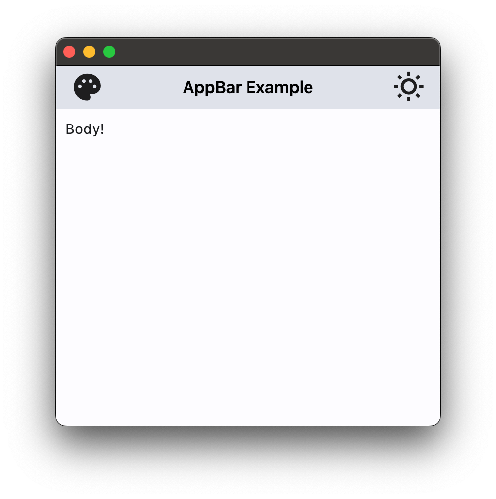
import flet as ft


def main(page: ft.Page):
    page.theme_mode = ft.ThemeMode.LIGHT

    page.appbar = ft.CupertinoAppBar(
        leading=ft.Icon(ft.Icons.PALETTE, color=ft.Colors.ON_SECONDARY),
        title=ft.Text("CupertinoAppBar Example"),
        trailing=ft.Icon(ft.Icons.WB_SUNNY_OUTLINED, color=ft.Colors.ON_SECONDARY),
        automatic_background_visibility=False,
        bgcolor=ft.Colors.SECONDARY,
        brightness=ft.Brightness.LIGHT,
    )

    page.add(ft.Text("Body!"))


ft.run(main)
App bar with theme mode toggle#
import flet as ft


def main(page: ft.Page):
    page.theme_mode = ft.ThemeMode.LIGHT

    def handle_theme_mode_toggle(e: ft.Event[ft.IconButton]):
        page.theme_mode = (
            ft.ThemeMode.DARK
            if page.theme_mode == ft.ThemeMode.LIGHT
            else ft.ThemeMode.LIGHT
        )
        theme_mode_button.icon = (
            ft.Icons.WB_SUNNY_OUTLINED
            if page.theme_mode == ft.ThemeMode.LIGHT
            else ft.Icons.WB_SUNNY
        )
        page.update()

    theme_mode_button = ft.IconButton(
        icon=(
            ft.Icons.WB_SUNNY_OUTLINED
            if page.theme_mode == ft.ThemeMode.LIGHT
            else ft.Icons.WB_SUNNY
        ),
        icon_color=ft.Colors.ON_INVERSE_SURFACE,
        on_click=handle_theme_mode_toggle,
    )

    page.appbar = ft.CupertinoAppBar(
        automatic_background_visibility=False,
        leading=ft.Icon(ft.Icons.PALETTE, color=ft.Colors.ON_INVERSE_SURFACE),
        bgcolor=ft.Colors.INVERSE_SURFACE,
        trailing=theme_mode_button,
        title=ft.Text("CupertinoAppBar Example", color=ft.Colors.ON_INVERSE_SURFACE),
    )

    page.add(ft.Text("Body!"))


ft.run(main)
Properties#
class-attribute
instance-attribute
#
automatic_background_visibility: bool | None = None
Whether the navigation bar should appear transparent when content is scrolled under it.
If False, the navigation bar will display its bgcolor.
class-attribute
instance-attribute
#
automatically_imply_leading: bool | None = None
class-attribute
instance-attribute
#
automatically_imply_title: bool | None = None
Whether we should try to imply the title control if None.
- If True and
titleisNone, aTextcontrol containing the current route's title will be automatically filled in. - If the
titleis notNone, this parameter has no effect.
class-attribute
instance-attribute
#
bgcolor: ColorValue | None = None
The fill color to use for this app bar.
Default color is defined by current theme.
class-attribute
instance-attribute
#
border: Border | None = None
The border of the app bar. By default, a single pixel bottom border side is rendered.
class-attribute
instance-attribute
#
brightness: Brightness | None = None
class-attribute
instance-attribute
#
enable_background_filter_blur: bool | None = None
Whether to have a blur effect when a non-opaque bgcolor is used.
This will only be respected when automatic_background_visibility
is False or until content scrolls under the navigation bar.
class-attribute
instance-attribute
#
leading: Control | None = None
A control to display at the start of this app bar.
Typically the leading control is an Icon or an IconButton .
If it is None and automatically_imply_leading is True,
an appropriate button will be automatically created.
class-attribute
instance-attribute
#
padding: PaddingValue | None = None
Defines the padding for the contents of the app bar.
If None, the app bar will adopt the following defaults:
- vertically, contents will be sized to the same height as the app bar itself minus the status bar.
- horizontally, padding will be
16pixels according to iOS specifications unless the leading widget is an automatically inserted back button, in which case the padding will be0.
Note
Vertical padding (top and bottom) won't change the height of this app bar.
class-attribute
instance-attribute
#
previous_page_title: str | None = None
Manually specify the previous route's title when automatically implying the leading back button.
Overrides the text shown with the back chevron instead of automatically showing the
previous route's title when automatically_imply_leading is True.
Note
Has no effect if leading is not None or if
automatically_imply_leading is False.
class-attribute
instance-attribute
#
title: StrOrControl | None = None
A string or a control to display in the middle of this app bar.
Typically a Text.
class-attribute
instance-attribute
#
trailing: Control | None = None
A Control to place at the end of the app bar.
Typically used for actions such as searching or editing.
class-attribute
instance-attribute
#
transition_between_routes: bool = True
Determines whether the app bar transitions between routes.
If True, this app bar will animate on top of route transitions when the
destination route also contains a CupertinoAppBar or CupertinoSliverAppBar with
transition_between_routes set to True.
This transition also occurs during edge back swipe gestures, mimicking native iOS behavior.
Note
When enabled, only one app bar can be present per route unless a
hero_tag is specified.