Chip
Basic Chip
Inherits: LayoutControl
Properties
-
autofocus(bool) –Whether this chip will be selected as the initial focus.
-
bgcolor(ColorValue | None) –Color to be used for the unselected, enabled chip's background.
-
border_side(BorderSide | None) –Defines the color and weight of this chip's outline.
-
check_color(ColorValue | None) –The color of this chip's check mark when a check mark is visible.
-
clip_behavior(ClipBehavior) –The content will be clipped (or not) according to this option.
-
color(ControlStateValue[ColorValue] | None) –The color that fills this chip in various
ControlState. -
delete_drawer_animation_style(AnimationStyle | None) –The animation style for the
delete_icon's animations. -
delete_icon(Control | None) –A
Controlto display to the right of this chip'slabel -
delete_icon_color(ColorValue | None) –The color of the
delete_icon. -
delete_icon_size_constraints(BoxConstraints | None) –The size constraints for the
delete_iconcontrol. -
delete_icon_tooltip(str | None) –The text to be used for this chip's
delete_icontooltip. If not provided or -
disabled_color(ColorValue | None) –The color used for this chip's background if it is disabled.
-
elevation(Number | None) –A non-negative value which defines the size of the shadow below this chip.
-
elevation_on_click(Number | None) –The elevation to be applied on this chip relative to its parent during the press
-
enable_animation_style(AnimationStyle | None) –The animation style for the enable and disable animations.
-
label(StrOrControl) –The primary content of this chip.
-
label_padding(PaddingValue | None) –The padding around the
label. -
label_text_style(TextStyle | None) –The style to be applied to this chip's
label. -
leading(Control | None) –A
Controlto display to the left of this chip'slabel. -
leading_drawer_animation_style(AnimationStyle | None) –The animation style for the
leadingcontrol's animations. -
leading_size_constraints(BoxConstraints | None) –The size constraints for the
leadingcontrol. -
padding(PaddingValue | None) –The padding between the
labeland the outside shape. -
select_animation_style(AnimationStyle | None) –The animation style for the select and unselect animations.
-
selected(bool) –If
on_selectevent is specified,selectedproperty is used to -
selected_color(ColorValue | None) –The color used for this chip's background when it is selected.
-
selected_shadow_color(ColorValue | None) –The color used for this chip's background
-
shadow_color(ColorValue | None) –The color used for this chip's background
-
shape(OutlinedBorder | None) –The shape of the border around this chip.
-
show_checkmark(bool) –If
on_selectevent is specified and chip is selected,show_checkmark -
visual_density(VisualDensity | None) –TBD
Events
-
on_blur(ControlEventHandler[Chip] | None) –Called when this chip has lost focus.
-
on_click(ControlEventHandler[Chip] | None) –Called when the user clicks on this chip.
-
on_delete(ControlEventHandler[Chip] | None) –Called when the user clicks on the
delete_icon. -
on_focus(ControlEventHandler[Chip] | None) –Called when this chip has received focus.
-
on_select(ControlEventHandler[Chip] | None) –Called when the user clicks on this chip.
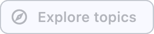
Examples#
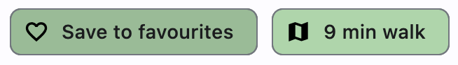
Assist chips#
Assist chips are chips with leading icon and on_click event specified.
They represent smart or automated actions that appear dynamically and contextually in a UI.
An alternative to assist chips are buttons, which should appear persistently and consistently.
import flet as ft


def main(page: ft.Page):
    def handle_chip1_click(e: ft.Event[ft.Chip]):
        e.control.label.value = "Saved to favorites"
        e.control.leading = ft.Icon(ft.Icons.FAVORITE_OUTLINED)
        e.control.disabled = True
        page.update()

    async def handle_chip2_click(e: ft.Event[ft.Chip]):
        await page.launch_url("https://maps.google.com")
        page.update()

    page.add(
        ft.Row(
            controls=[
                ft.Chip(
                    label=ft.Text("Save to favourites"),
                    leading=ft.Icon(ft.Icons.FAVORITE_BORDER_OUTLINED),
                    bgcolor=ft.Colors.GREEN_200,
                    disabled_color=ft.Colors.GREEN_100,
                    autofocus=True,
                    on_click=handle_chip1_click,
                ),
                ft.Chip(
                    label=ft.Text("9 min walk"),
                    leading=ft.Icon(ft.Icons.MAP_SHARP),
                    bgcolor=ft.Colors.GREEN_200,
                    on_click=handle_chip2_click,
                ),
            ]
        )
    )


ft.run(main)
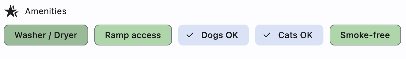
Filter chips#
Filter chips are chips with on_select event specified.
They use tags or descriptive words provided in the label to filter content.
They can be a good alternative to switches or checkboxes.
import flet as ft


def main(page: ft.Page):
    def handle_amenity_selection(e: ft.Event[ft.Chip]):
        page.update()

    amenities = ["Washer / Dryer", "Ramp access", "Dogs OK", "Cats OK", "Smoke-free"]

    page.add(
        ft.Row(controls=[ft.Icon(ft.Icons.HOTEL_CLASS), ft.Text("Amenities")]),
        ft.Row(
            controls=[
                ft.Chip(
                    label=ft.Text(amenity),
                    bgcolor=ft.Colors.GREEN_200,
                    disabled_color=ft.Colors.GREEN_100,
                    autofocus=True,
                    on_select=handle_amenity_selection,
                )
                for amenity in amenities
            ]
        ),
    )


ft.run(main)
Properties#
class-attribute
instance-attribute
#
autofocus: bool = False
Whether this chip will be selected as the initial focus.
If there is more than one control on a page with autofocus set, then the first one added to the page will get focus.
class-attribute
instance-attribute
#
bgcolor: ColorValue | None = None
Color to be used for the unselected, enabled chip's background.
class-attribute
instance-attribute
#
border_side: BorderSide | None = None
Defines the color and weight of this chip's outline.
class-attribute
instance-attribute
#
check_color: ColorValue | None = None
The color of this chip's check mark when a check mark is visible.
class-attribute
instance-attribute
#
clip_behavior: ClipBehavior = NONE
The content will be clipped (or not) according to this option.
class-attribute
instance-attribute
#
color: ControlStateValue[ColorValue] | None = None
The color that fills this chip in various ControlState.
class-attribute
instance-attribute
#
delete_drawer_animation_style: AnimationStyle | None = None
The animation style for the delete_icon's animations.
class-attribute
instance-attribute
#
delete_icon_color: ColorValue | None = None
The color of the delete_icon.
class-attribute
instance-attribute
#
delete_icon_size_constraints: BoxConstraints | None = None
The size constraints for the delete_icon control.
If None, it defaults to a minimum size of chip height or label height
(whichever is greater) and a padding of 8.0 pixels on all sides.
class-attribute
instance-attribute
#
delete_icon_tooltip: str | None = None
The text to be used for this chip's delete_icon tooltip. If not provided or
provided with an empty string, the tooltip of the delete icon will not be displayed.
class-attribute
instance-attribute
#
disabled_color: ColorValue | None = None
The color used for this chip's background if it is disabled.
class-attribute
instance-attribute
#
elevation: Number | None = None
A non-negative value which defines the size of the shadow below this chip.
Defaults to 0.
Raises:
-
ValueError–If
elevationis negative.
class-attribute
instance-attribute
#
elevation_on_click: Number | None = None
The elevation to be applied on this chip relative to its parent during the press motion. This controls the size of the shadow below this chip.
Defaults to 8.0.
Raises:
-
ValueError–If it is less than
0.0.
class-attribute
instance-attribute
#
enable_animation_style: AnimationStyle | None = None
The animation style for the enable and disable animations.
instance-attribute
#
label: StrOrControl
The primary content of this chip.
Typically a Text control.
class-attribute
instance-attribute
#
label_padding: PaddingValue | None = None
class-attribute
instance-attribute
#
label_text_style: TextStyle | None = None
The style to be applied to this chip's label.
class-attribute
instance-attribute
#
leading: Control | None = None
A Control to display to the left of this chip's label.
Typically the leading control is an Icon or a CircleAvatar.
class-attribute
instance-attribute
#
leading_drawer_animation_style: AnimationStyle | None = None
The animation style for the leading control's animations.
class-attribute
instance-attribute
#
leading_size_constraints: BoxConstraints | None = None
The size constraints for the leading control.
If None, it defaults to a minimum size of chip height or label height
(whichever is greater) and a padding of 8.0 pixels on all sides.
class-attribute
instance-attribute
#
padding: PaddingValue | None = None
The padding between the label and the outside shape.
Defaults to 8 logical pixels on all sides.
class-attribute
instance-attribute
#
select_animation_style: AnimationStyle | None = None
The animation style for the select and unselect animations.
class-attribute
instance-attribute
#
selected: bool = False
If on_select event is specified, selected property is used to
determine whether this chip is selected or not.
class-attribute
instance-attribute
#
selected_color: ColorValue | None = None
The color used for this chip's background when it is selected.
class-attribute
instance-attribute
#
selected_shadow_color: ColorValue | None = None
The color used for this chip's background
when the elevation is greater than 0 and this chip is selected.
class-attribute
instance-attribute
#
shadow_color: ColorValue | None = None
The color used for this chip's background
when the elevation is greater than 0 and this chip is not selected.
class-attribute
instance-attribute
#
shape: OutlinedBorder | None = None
The shape of the border around this chip.
Defaults to ChipTheme.shape, or if that is resolves to
None, falls back to RoundedRectangleBorder(radius=8).
class-attribute
instance-attribute
#
show_checkmark: bool = True
If on_select event is specified and chip is selected, show_checkmark
is used to determine whether or not to show a checkmark.
Events#
class-attribute
instance-attribute
#
on_blur: ControlEventHandler[Chip] | None = None
Called when this chip has lost focus.
class-attribute
instance-attribute
#
on_click: ControlEventHandler[Chip] | None = None
Called when the user clicks on this chip.
Raises:
-
ValueError–If specified together with
on_select.
class-attribute
instance-attribute
#
on_delete: ControlEventHandler[Chip] | None = None
Called when the user clicks on the delete_icon.
class-attribute
instance-attribute
#
on_focus: ControlEventHandler[Chip] | None = None
Called when this chip has received focus.
class-attribute
instance-attribute
#
on_select: ControlEventHandler[Chip] | None = None
Called when the user clicks on this chip.
It internally changes selected property to the opposite value.
Raises:
-
ValueError–If specified together with
on_click.