BottomAppBar
Basic BottomAppBar
Inherits: LayoutControl
Properties
-
bgcolor(ColorValue | None) –The fill color to use for this app bar.
-
clip_behavior(ClipBehavior) –Defines how the
contentof this app bar should be clipped. -
content(Control | None) –The content of this bottom app bar.
-
elevation(Number | None) –This property controls the size of the shadow below this app bar.
-
notch_margin(Number) –The margin between the
FloatingActionButtonand this -
padding(PaddingValue | None) –Empty space to inscribe inside a container decoration (background, border).
-
shadow_color(ColorValue | None) –The color of the shadow below this app bar.
-
shape(NotchShape | None) –The notch that is made for the floating action button.
Examples#
Notched FloatingActionButton#
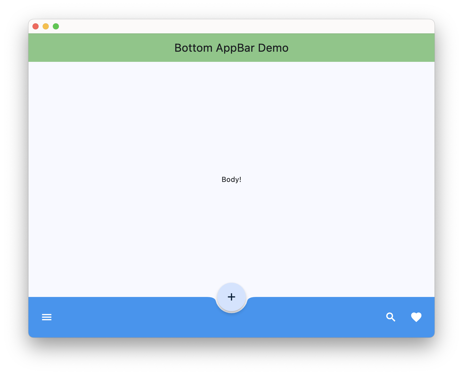
import flet as ft
def main(page: ft.Page):
page.vertical_alignment = ft.MainAxisAlignment.CENTER
page.horizontal_alignment = ft.CrossAxisAlignment.CENTER
page.floating_action_button = ft.FloatingActionButton(
icon=ft.Icons.ADD,
shape=ft.CircleBorder(),
)
page.floating_action_button_location = ft.FloatingActionButtonLocation.CENTER_DOCKED
page.appbar = ft.AppBar(
title=ft.Text("Bottom AppBar Demo"),
center_title=True,
bgcolor=ft.Colors.GREEN_300,
automatically_imply_leading=False,
)
page.bottom_appbar = ft.BottomAppBar(
bgcolor=ft.Colors.BLUE,
shape=ft.CircularRectangleNotchShape(),
content=ft.Row(
controls=[
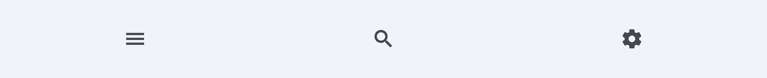
ft.IconButton(icon=ft.Icons.MENU, icon_color=ft.Colors.WHITE),
ft.Container(expand=True),
ft.IconButton(icon=ft.Icons.SEARCH, icon_color=ft.Colors.WHITE),
ft.IconButton(icon=ft.Icons.FAVORITE, icon_color=ft.Colors.WHITE),
]
),
)
page.add(ft.Text("Body!"))
ft.run(main)
Properties#
class-attribute
instance-attribute
#
bgcolor: ColorValue | None = None
The fill color to use for this app bar.
Defaults to BottomAppBarTheme.bgcolor, or if
that is None, falls back to ColorScheme.surface.
class-attribute
instance-attribute
#
clip_behavior: ClipBehavior = NONE
Defines how the content of this app bar should be clipped.
class-attribute
instance-attribute
#
content: Control | None = None
The content of this bottom app bar.
class-attribute
instance-attribute
#
elevation: Number | None = None
This property controls the size of the shadow below this app bar.
Raises:
-
ValueError–If
elevationis negative.
class-attribute
instance-attribute
#
notch_margin: Number = 4.0
The margin between the FloatingActionButton and this
app bar's notch.
Can be visible only if shape is None.
class-attribute
instance-attribute
#
padding: PaddingValue | None = None
Empty space to inscribe inside a container decoration (background, border).
Defaults to BottomAppBarTheme.padding, or if
that is None, falls back to Padding.symmetric(vertical=12.0, horizontal=16.0).
class-attribute
instance-attribute
#
shadow_color: ColorValue | None = None
The color of the shadow below this app bar.
class-attribute
instance-attribute
#
shape: NotchShape | None = None
The notch that is made for the floating action button.